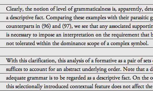
Vertical Rhythm is simply when a body of text is aligned to evenly spaced horizontal lines (think of your lined paper from grade school), making it more cohesive and easier to read. Gridwax.gs is a free tool to check any sites vertical rhythm.
Just like in music, great rhythm is essential. Great rhythm feels tight and professional, while bad rhythm can make things awkward (which is why I don't play the drums). Rhythm does not have to be rigid and just like any rule can be bent or broken. Great examples of odd rhythms would be how The Beatles used shifting meters in "Strawberry Fields", and quintuple meters in "Within You, Without You". We can dive into music theory later, for now lets just stick to typography.
Getting to work
So what impacts a pages vertical rhythm? Font size, line height and margins/padding. In order to achieve a good rhythm we have to calculate these three factors and apply them in our CSS. Here is our example text.

With just setting a base font-size and nothing else, our example is out of rhythm. While the first line is lined up correctly, things fall apart quickly. Line three is way off, and by the fourth line its already in-between. Lets take a look at how to establish our rhythm.
Paragraphs and body text
First things first we need to pick a time signature, or base font-size to calculate our rhythm from. In this example I picked 20px to make things easy on the eyes. In my experience a line height of 1.5 x the base font size is a great place to start, and is usually right on target. Easy enough in CSS, lets set body font-size: 20px and line-height: 1.5em. This will be our foundation to build from.
We'll keep working by targeting our <p> tag. Set the margin to 0, font-size: 1em;, again the line-height: 1.5em; and finally a bottom-margin: 1.5em;. This sets the break between paragraphs to exactly one line of text keeping everything in sync. Already we can see the results:

Headlines
Headlines are much larger than body text and if left unattended will throw off the rhythm of the page. We don't want that so lets include them into our calculations as well. How are we going to do this? Our good friend The Modular Scale, which will help us determine our headline sizes from our base font size. If you don't know about the Modular Scale, be sure to read Billy Whited's great post on Relational Design.
By using the modular scale with our base font-size of 20px on the perfect-fourth ratio, the <h1> will be 2.369em. But how do we figure out it's line-height and margins? Divide 1.5 (our base line-height) by 2.369 (target font-size) and we get 0.63317856em. Don't chop about all those decimal places, the computer is very happy working with them (remember Number Munchers?). Plug that into the line-height and margin-bottom for the <h1> and we are back in rhythm. The same can be applied to the rest of our headlines. <h2> would be 1.5 / 1.777 = 0.8441193em. After applying this to our CSS and going back to the example, everything is in rhythm and looking good.

With a little bit of work and tiny bit of math (that wasn't so bad was it?) our example text now flows, feels much more professional and readable, and is a lot easier on the eyes. If you wan't to change your body font-size you will have to re-do the <p> and <h> tags... or will you? In my next post we'll look into using SASS to simplify the whole process, and take a closer look at a few gotchas.


