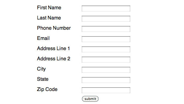
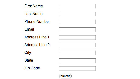
A few weeks ago, my co-workers asked me to demonstrate how to convert a form built using HTML table elements into a more meaningful form structured with semantic HTML. Given the accessibility issues that affect table-based forms, I was more than happy to oblige.
Just to be clear, I don’t think that “tables are evil.” I actually feel quite the opposite. Tables have their place—they are absolutely fantastic for marking up tabular data like train schedules, stock quotes, spreadsheets and etceteras (which is what they were actually intended for.)
However, given their inherent grid-like structure, tables are sometimes used to lend a scaffolding to other elements like forms and divs that are inherently unstructured. Using tables in this way is an abuse and runs counter to the widely accepted notion that we, as web designers and developers, should strive to isolate our structural (HTML), presentational (CSS), and behavioral (JS) components.
Why Tables Are Inappropriate For Forms
Using tables to mark up forms is inappropriate for a few reasons:
- Marking up forms with tables adds unnecessary markup and decreases maintainability.
- Inserting form elements like labels and inputs in separate table cells erodes the fundamental relationships otherwise defined by their proximity to one another. This prevents users who rely on screen readers or other assistive devices from efficiently navigating your form.
- Tables are devices intended for information output, while forms are intended form information input.This is a fundamental inconsistency.

The HTML source for the table based form:
<form action="" method="">
		<table>
				<tbody>
						<tr>
								<td><label for="first-name">First name</label></td>
								<td><input id="first-name" name="first-name" type="text"></td>
						</tr>
						<tr>
								<td><label for="last-name">Last name</label></td>
								<td><input id="last-name" name="last-name" type="text"></td>
						</tr>
						<tr>
								<td><label for="phone-number">Phone Number</label></td>
								<td><input id="phone-number" name="phone-number" type="text"></td>
						</tr>
						<tr>
								<td><label for="email">Email</label></td>
								<td><input id="email" name="email" type="text"></td>
						</tr>
						<tr>
								<td><label for="address-1">Address Line 1</label></td>
								<td><input id="address-1" name="address-1" type="text"></td>
						</tr>
						<tr>
								<td><label for="address-2">Address Line 2</label></td>
								<td><input id="address-2" name="address-2" type="text"></td>
						</tr>
						<tr>
								<td><label for="city">City</label></td>
								<td><input id="city" name="city" type="text"></td>
						</tr>
						<tr>
								<td><label for="state">State</label></td>
								<td><input id="state" name="state" type="text"></td>
						</tr>
						<tr>
								<td><label for="zip-code">Zip Code</label></td>
								<td><input id="zip-code" name="zip-code" type="text"></td>
						</tr>
						<tr>
								<td></td>
								<td><input type="submit" value="submit"></td>
						</tr>
				</tbody>
		</table>
</form>
The CSS for the table based form:
body {
		background: #fff;
		font-family: sans-serif;
}
form {
		margin: 50px auto;
		width: 300px;
}
label {
		display: inline-block;
		text-transform: capitalize;
		width: 145px;
}
input[type="text"] {
		width: 150px;
}
table {
		border-spacing: 0;
		border-collapse: collapse;
		width: 300px;
}
td {
		padding: 5px 0;
}
Why You Should Build A More Semantic Form
There are several HTML elements that are specifically intended for use inside of forms and you should always make it a point to use them. Some of these elements include: divs, labels, and inputs. Here are a couple advantages of using them:
- Labels and inputs have an explicit, meaningful relationship. Placing these elements next to each other in your form will help to better convey the meaning of your document to web crawlers, screen readers and other assistive devices.
- Using divs to group related items (i.e. labels and inputs) will cutdown on the amount of code needed to markup a form. What’s more, divs were expressly intended to group related content and using them in appropriate fashion will improve the semantics of your document which, in turn, improves your SEO.
- By applying CSS intelligently, you can use these elements to construct a form that can take almost any shape—with less code. Furthermore, by separating structure from presentation, you can make your form more maintainable so changes to your layout merely require an adjustment to your CSS (rather than an adjustment to your CSS and your HTML).

The HTML for a more semantic form:
<form action="" method="">
		<div>
				<label for="first-name">First name</label>
				<input id="first-name" name="first-name" type="text">
		</div>
		<div>
				<label for="last-name">Last name</label>
				<input id="last-name" name="last-name" type="text">
		</div>
		<div>
				<label for="phone-number">Phone Number</label>
				<input id="phone-number" name="phone-number" type="text">
		</div>
		<div>
				<label for="email">Email</label>
				<input id="email" name="email" type="text">
		</div>
		<div>
				<label for="address-1">Address Line 1</label>
				<input id="address-1" name="address-1" type="text">
		</div>
		<div>
				<label for="address-2">Address Line 2</label>
				<input id="address-2" name="address-2" type="text">
		</div>
		<div>
				<label for="city">City</label>
				<input id="city" name="city" type="text">
		</div>
		<div>
				<label for="state">State</label>
				<input id="state" name="state" type="text">
		</div>
		<div>
				<label for="zip-code">Zip Code</label>
				<input id="zip-code" name="zip-code" type="text">
		</div>
		<input type="submit" value="submit">
</form>
The CSS for a more semantic form:
body {
		background: #fff;
		font-family: sans-serif;
}
form {
		margin: 50px auto;
		width: 300px;
}
div {
		display: inline-block;
		padding: 5px 0;
		width: 300px;
}
label {
		text-align: middle;
		text-transform: capitalize;
		width: 150px;
}
input[type="text"] {
		float: right;
		width: 150px;
}
input[type="submit"] {
		margin-left: 145px;
}
To Be Continued…
In Part 2, we’ll explore a few additional attributes and elements you can add to your forms in order to make them even more meaningful, accessible, and user friendly.


