

Last week, we took a closer look at some simple “under the hood” changes you can make to your forms to improve their usability and accessibility.
In this third and final installment of “A Tale of Two Forms,” well examine a few ways you can tweak the design/layout of your forms in order to improve these attributes
I’ll be the first to admit that designing forms can be a rather uninspiring process, but I would argue that there are few other areas of web design that carry as much importance.
I’ll jump into basic form design principles shortly, but before I do I want to urge you to review the previous two articles on forms so you can recap where we’ve been—and where we still need to go. You can find those articles here:
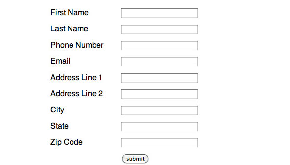
Also, here is a look at what our form looked like the last time we gave it any visual consideration:
Basic Principles of Form Design
As you can see above, we have a fairly nondescript form on our hands. It’s got some fields, a submit button and is, for the most part, un-styled. I’ve seen tons of forms like this one scattered about the internet and I for one won’t argue that there is anything inherently wrong with an un-styled form.
In fact, given how insistent (dictatorial?) most browsers are with the styling of their form elements, and how disparate the rendering of form elements is across the browser landscape, there are distinct advantages to leaving your form elements alone.
However, aside from the lack of decoration on this form, there are still some pretty glaring issues with it’s design. We’ve got room for improvement here. So let’s examine a few basic principles of form design and apply them to this design.
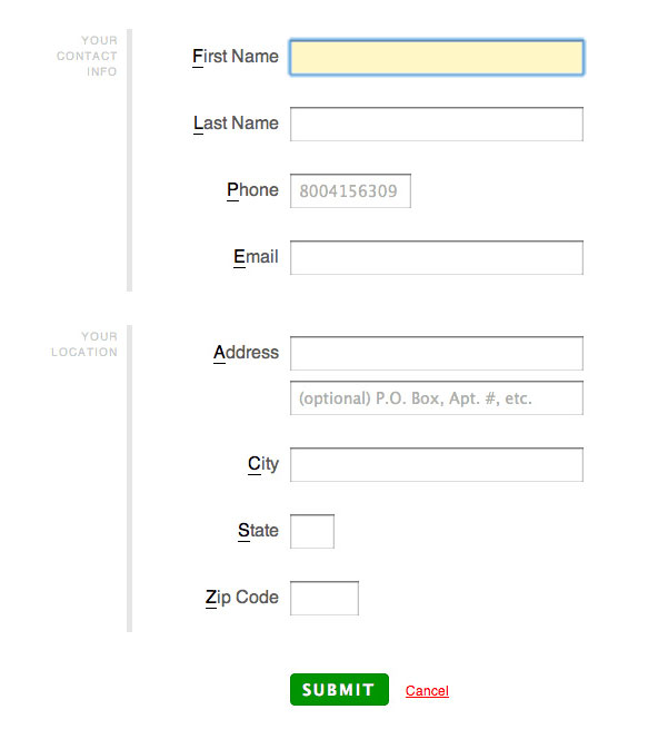
Label Alignment
The alignment of form labels is one of those subtle design considerations that can have a considerable impact on the performance of your form. In the above example, the labels are all left aligned. While this has a certain visual appeal, it turns out to be the least efficient way to place them.
When form labels are left aligned, users spend precious extra seconds scanning back and forth between label and input. As a result, it takes users longer to fill out forms with left aligned labels than it does to fill out a form with top (the most efficient) or right (the second most efficient) aligned labels.
Now, this isn’t all bad because there might be a situation in which you want to slow users down. Also, left aligned labels are the easiest to scan, so on forms with many fields they might make some sense. But, given how short our form is, it makes sense to optimize for ease of use and vertical space savings. Let’s align our labels to the right.
Input Affordances
The term “affordance,” as it relates to design, basically means the same thing as “clue.” Think about a door that you have to pull to open on one side, and push to open on the other. How do you design a solution that communicates this fundamental aspect of the door?
Well, the door handle “affords” the pulling action, while the door plate “affords” the pushing action. For most people, this interaction is intuitive. By imbuing our form with affordances, we can give our users hints that make them a little easier to complete.
Perhaps the easiest way to do this with web forms is to restrict certain field inputs to a length that corresponds with the data they are asking for (we already know we can do this, at least in part, with the maxlength attribute.)
For example, this technique comes in handy when working with phone number, zip code and state fields. By shortening these fields, we give users a clue about how the system expects them to enter their information. In this way, we can actually prevent errors before they even happen!
Information Chunking
Depending on the nature of your form, you might find that several of your input fields ask for related information. In our above example it would seem that the first name, last name, phone, and email fields could all be grouped under a general category of “contact information.”
Using the fieldset element we can semantically group related elements and “chunk” our fields into sets that provide context and meaning to our users. We can then style these fieldsets to create visual separations.
By breaking our forms up into logical sections, we can make them appear less daunting, provide context to our users about the nature of the information we are asking them for, and help those users with assistive devices more easily navigate (and understand) them.
Primary and Secondary Actions
Often forms have more than one action a user can take. There is frequently a submit button and perhaps a cancel, continue, next or back button. In almost all cases, these buttons carry different weight or significance for the user.
For instance, we wouldn’t want a submit and a cancel button to share the exact same styling—doing so would make users much more likely to click the wrong button by mistake.
As a result, it’s a good idea to determine which of your form buttons correspond with “primary” actions and which with “secondary” (or tertiary, quaternary, etc.) Once you’ve made this distinction, you can visually emphasize the “primary” action and allow the “secondary” button to recede visually.
Pulling it all together
Here’s what our form looks like after applying the design principles above and some of the tips from my previous two articles:
You can view the source for our final form here:
Recommended Reading

Web Form Design by Luke Wroblewski
For a more profound and in-depth look into the design of forms on the web, I couldn’t recommend this book more.

The Design of Everyday Things by Donald Norman
This book provides profound insights into the nature of human computer interaction. By examining overlooked design principles, Norman ensures that you’ll never think about your surroundings in the same way again.


