

I am a trained sculptor and have always been comfortable being creative within the constraints of the three-dimensional realm. Ironically, I now find myself gainfully employed as a web designer, despite spending years studying the finer arts.
Nevertheless, my transition from solving problems within three-dimensions to solving problems within two has presented interesting challenges. Chief among these is my ongoing struggle to understand and effectively employ that subtle art of arranging type: Typography.
Typography is a humble pursuit. When done well, it goes unnoticed. Well set type is bashful; it recedes from view in deference to its singular purpose: to communicate thoughts.
One might feel that a passage is visually appealing, but be unable to identify what makes it so; the medium fades while the message remains. This is the essence of good typography. It’s invisible.
A Letterpress Adventure
Until recently, my approach to setting type has been rooted in pure guesswork. And though effective typography relies, to an extent, on a rigorous process of trial and error, I was simply flying blind. I sought to understand…so I began an internship with a traditional letterpress printer by the name of Paul Aken.
Paul is an anachronism. A pragmatic and self-described “old coot,” it’d be accurate to call him “a bit of an eccentric.” Though decidedly lovable, he always manages to talk at volume several decibels higher than what’s appropriate for the space he occupies.
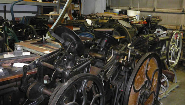
The Platen Press Museum in Zion, Illinois (where Paul has seemingly spent the majority of his retirement) is stacked floor-to-ceiling with his collection of rarefied printing presses, type cases, and myriad other historical anomalies.
Most days there is barely room to move around because “The Collection,” as I like to call it, has a mind of its own. It breathes, ever shifting its content from one room of the museum to another.

However, buried beneath this facade of disorganization, there is a brilliant mind at play. Paul is equal parts mad genius and magician. He possesses a remarkable working knowledge of every one of his printing presses (numbering in the low hundreds), many of which were cast well before the turn of the twentieth century.
Paul’s dedication to the craft of letterpress printing, which he has taught for decades, is the stuff of legend. Even now, well into his retirement, he continues to devote the majority of his time to the pursuit of a craft that for most, is a mere footnote in the pages of a history rife with quaint, forgotten pastimes. Paul is the embodiment of pedagogical dedication.
In what essentially amounts to a 1:1 exchange of “help me out around the museum time” for “I’ll teach you everything you could ever want to know about letterpress time,” Paul has generously heightened my understanding of typography by indoctrinating me into the esoteric world of traditional handset typography.
It was during my internship at The Platen Press Museum that my understanding and appreciation of type flourished. Rather unexpectedly, letterpress fused my three-dimensional aptitude with a creative facility in two-dimensions. By extension, it increased my comfort level with my daily practice of user interface design (which is 95% typography).
I believe this fusion arose in large part because letterpress printing is, at its core, a sculptural enterprise. The printed page is the result, of course, but in my way of seeing things, it is merely an by-product. For me, the joy resides in the physicality of the process itself.
Consider the beautiful precision of the presses; the mechanics of the lever; the endless rotation of the ink plate; the smell of the ink and the persistence of its residue; the nimble choreography of patient fingers; the tedium…these are concepts a sculptor understands well.

In letterpress, words are not “processed.” They are laboriously “handset” in “composing sticks,” and compiled into “forms” which resemble Constructivist sculptures.
There is an expertise, perhaps even a dignity, in the arrangement of the type. Letters (sorts) require careful handling as they possess an inherent fragility and susceptibility to breakage. Ultimately, one must be respectful. In the world of letterpress there are no “undo” buttons.
Unlike on the computer, in letterpress one must engage with the spaces in between lines and letters. These interstices are substantive: the negative space actual. For me, previously abstract ideas like “leading,” “measure,” and “justification” were rendered concrete by the fact that I had to coerce the needed values with real pieces of lead.
For example, a line’s measure must be determined before composing a form because leads (pieces of metal that add space between lines of type) must be cut, and composing sticks set, to exactly match this length.
It is only after this number is determined that a page can begin to take shape. What’s more, almost every other design choice is constrained by the length of the measure.
I find that this order of operations is also relevant for typesetting on the web. Resultantly, line measure has become one of the first values I calculate when working out a new design.

These days, when I encounter difficulty with the typographical details for a particular design I play a little mind-game with myself. I close my eyes and visually translate the two-dimensional image of the screen into a three-dimensional type form, complete with necessary components.
I recall the independence of the sorts, the rhythm of the leads and the physical constraints of a predetermined measure. I manipulate the pieces in my mind. I assemble my sculpture. When finally I open my eyes, the byproduct of this exercise—my website design—begins to reveal itself.


